You should give me feedback! Would love to know your thoughts and opinions.
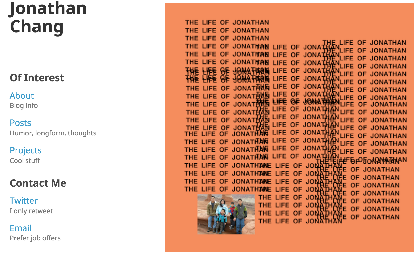
That was my old site design above. I’ve had the same website design for more than 3 years. And so I really wanted to change things up. I was greatly inspired by my friend Janice, who has a really nice blog documenting her time in Taiwan this year.
Old site, the good:
- Clean. White background with simple serif typeface.
- Pretty mobile-friendly (as in, it worked on mobile).
- Decent speed due to all static content.
- Design felt more distinct than the Medium-clone designs that a lot of other blogs used.
Old site, the bad:
- The major thing was unneccessary clicks, which limits the amount of content viewed. It began at the start page. To see if there was any new content, you had to click posts, and then check if any of the titles were new. Then, to view other posts, it took 2 clicks again.
- Uneven experience across devices. The typography didn’t seem to render uniformly across devices. Smaller screen sizes had issues with some media (Youtube embeds weren’t responsive).
- Started to feel outdated. Just felt like blog designs had moved on, like a lot.
New site, what’s better:
- Immediately see post content from the home page (the 10 latest). Saves one click to view a full post. Hopefully allows for more content discoverability and a lower site bounce rate.
- Media-focused. Able to preview images from posts on the home page.
- Typography. I spent a really long time thinking and trying out different typefaces. I settled on a monospace typeface, Roboto Mono, for headings. I think Roboto Mono has a slightly quirky, retro-yet-techie feel, which I hope reflects the content of this blog. For body content, I chose to use Open Sans. I like the readability of this proportional typeface (monospace is harder to read in paragraphs, spaces feel way too big). It isn’t flashy but I like that its stroke width is very slightly thinner than a lot of standard typefaces, which I think gives it a lightness and friendliness.
- Posts page. Now has a timeline, which I think is really cool.
- Utilizes more screen space with a wider design. I’m also trying to think about what a post would look like if it were shared (previous website wasn’t really designed to have content shared).
- Content tags. I’m able to classify my content into categories. I also am able to mark some of it as “Best Work” to show which pieces are the most important to me personally and that I’m most proud of.
- Favicon. I designed a new favicon that I like. It’s a flaming orange asteroid. Below is a bigger, uncropped version. Graphic designers, help me out pls.

- URLs. Don’t have the pesky .html ending anymore. jchang.me/New-Site is better than jchang.me/New-Site.html, in my opinion.
- Better SEO? My old site’s web indexing results on Google were worsening. This site generates a feed.xml which should help with web-crawling. We’ll see if that helps.
New site, to do:
- Properly migrate content over (e.g., checking if images still work, media aligned correctly, etc.)
- Need to update and properly categorize and tag old posts, which will take some time.
- Design tweaks. I’m not sure about things like the white background. Also color choices. And smaller things like the color of links on mouse hovers.
- Rethink the Projects page? Not sure if I’m displaying this page in the best way.
- Richer content. Trying to blend multimedia with text for fuller storytelling. And also just write more thoughtful things, more often.
- Solicit your feedback. Let me know what your thoughts are!